Drawing realistic makeup requires understanding both the technical fundamentals of color theory and the anatomical subtleties of facial features. Whether you’re an aspiring digital artist, illustrator, or concept designer, mastering the art of rendering cosmetics authentically can elevate your work from amateur to professional. This comprehensive guide explores the essential techniques, materials, and approaches that professional artists use to create convincing makeup illustrations that capture light, texture, and dimension with precision.
The key to drawing cosmetics realistically lies in observing how makeup interacts with skin texture, light reflection, and the underlying facial structure. Makeup isn’t simply applied as a flat color over the face—it has depth, translucency, and responds to light in specific ways depending on the product type. Foundation sits differently than powder, lipstick has distinct shine properties compared to matte liquid lip colors, and eyeshadow creates dimensional effects through blending and layering. By understanding these nuances and studying real makeup application, you’ll develop the eye for detail necessary to render cosmetics authentically in your artwork.
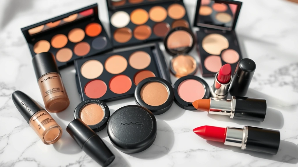
Understanding Makeup Product Types and Their Visual Properties
Before you begin drawing cosmetics, you must understand how different makeup products appear visually and behave under various lighting conditions. Each category of cosmetic has distinct characteristics that affect how you should render it in your artwork.
Foundation and Base Products: Foundation creates the base layer for all other makeup. It typically has a matte or satin finish and sits on top of the skin, creating subtle coverage that doesn’t appear plastic or heavily applied. When drawing foundation, focus on creating smooth transitions while maintaining skin texture beneath. Foundation should never look completely uniform—real skin has variations in tone, slight imperfections, and areas where foundation sits thicker or thinner. A proper skincare routine for glowing skin underneath affects how foundation appears, creating a more luminous base.
Powders and Setting Products: Powder has a velvety, light-diffusing quality that appears less reflective than liquid products. When rendering powder, use softer edges and avoid harsh highlights. Powder creates a more matte appearance and can appear slightly chalky if over-applied. The texture should feel fine and delicate in your rendering.
Cream and Liquid Products: Cream blushes, liquid highlighters, and liquid eyeshadows have more shine and translucency. These products reflect light more noticeably and create glossy, dimensional effects. When drawing these, incorporate stronger highlights and consider how the product catches light on the highest points of the face.
Eyeshadow and Pigments: Eyeshadow exists in countless finishes—matte, shimmer, metallic, and glitter. Matte eyeshadow appears flat and absorbs light, while shimmer eyeshadow reflects light in multiple directions. Metallic finishes create concentrated highlights, and glitter adds sparkle points. Your rendering should reflect these distinctions through highlight placement and intensity.
Lipstick and Lip Products: Lipstick finishes range from matte to glossy. Matte lipsticks have minimal shine and defined edges, while glossy products create strong highlights and appear wet. The lip shape becomes more apparent with color, and you must render the natural lip contours beneath the color. Consider how light reflects off curved lip surfaces.
Foundational Skills: Anatomy and Proportion
Accurate makeup drawing begins with solid understanding of facial anatomy. You cannot convincingly render makeup without knowing the underlying structure that the cosmetics sit upon. Study the facial proportions, muscle structure, and how skin drapes over bone.
Facial Landmarks: Identify key landmarks where makeup sits differently. The cheekbone is higher than most artists initially assume, the eye socket has specific depth, and the lips have a distinct three-dimensional structure. Makeup application follows these anatomical features—blush is placed on the apples of the cheeks, contour follows natural shadow areas created by bone structure, and eyeshadow is applied within the eye socket’s natural topology.
Skin Surface Topology: The face isn’t flat. It has curves, planes, and transitions. Understanding these surfaces helps you render makeup realistically because cosmetics follow these contours. The forehead has a slight curve, cheeks are rounded, and the chin has depth. Makeup highlights these features through light reflection and color placement.
Proportional Guidelines: While individual faces vary, general proportions help create believable artwork. The distance between eyes typically equals one eye width. The face divides into thirds horizontally. The mouth sits approximately one-third down from the nose to the chin. These guidelines ensure your makeup rendering sits properly on an anatomically sound face.
Study reference images extensively. Photograph real makeup application, observe makeup tutorials, and practice drawing faces with and without makeup. This comparative study develops your ability to see how makeup transforms features.
Color Theory and Pigment Mixing for Cosmetics
Makeup colors are highly specific and influenced by undertones, skin tone, and lighting conditions. Understanding color theory is essential for rendering cosmetics authentically.
Undertone Considerations: Makeup colors appear different depending on skin undertones. A warm undertone skin absorbs warm makeup colors differently than cool undertone skin. When drawing makeup, consider the underlying skin’s undertone and how it interacts with the cosmetic color. A cool-toned eyeshadow on warm skin appears more vibrant, while the same shadow on cool skin might appear muted.
Color Mixing and Blending: Makeup is rarely a single, flat color. Blended makeup creates gradients and color transitions. When rendering, mix colors gradually rather than applying stark color changes. Eyeshadow blending creates smooth transitions from darker to lighter shades. Blush blends into skin, creating a gradient from concentrated color to natural skin tone. Lipstick edges blend into surrounding skin.
Saturation and Value: Professional makeup application uses colors at varying saturation levels. Concentrated color sits closer to the lash line or center of the lips, while saturation decreases toward edges. Value—the lightness or darkness of a color—changes as makeup blends. A dark eyeshadow appears lighter at its edges due to blending. Understanding this helps create realistic transitions in your drawings.
Lighting Effects on Color: The same makeup color appears different under various lighting. Warm lighting makes colors appear warmer and more saturated. Cool lighting creates cooler tones and potentially desaturates colors. When drawing, consider your light source and adjust colors accordingly. A makeup look photographed in natural daylight appears different under studio lighting.
Mastering Facial Features with Makeup
Different facial features require specific approaches when rendering makeup. Each feature has unique characteristics that affect how cosmetics appear.
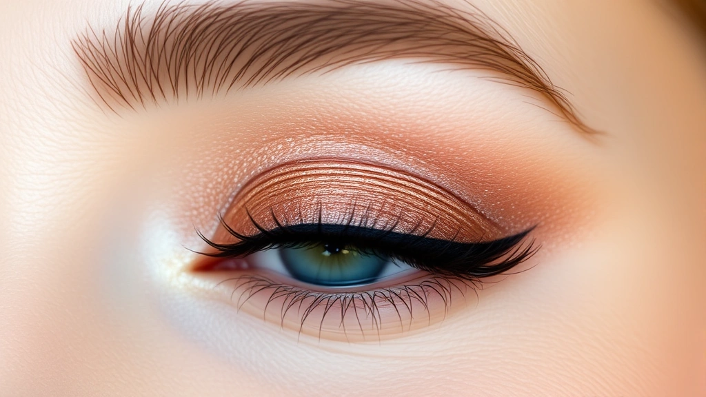
Eyes and Eyeshadow: The eye area is the most complex feature to render with makeup. The eye socket has depth, the eyelid has curvature, and eyeshadow must follow these contours realistically. When drawing eyeshadow, observe how color sits in the crease, how it follows the eye socket’s natural shape, and how light reflects off shimmery finishes. The eyelid isn’t flat—it curves from the inner corner to the outer corner. Eyeshadow application respects this curve.
Eyeliner and mascara add definition. Eyeliner sits along the lash line and appears darker and more defined near the inner corner. Mascara creates texture and definition on individual lashes. When rendering these elements, use precise linework for eyeliner and varied stroke weights for mascara to suggest individual lashes rather than painting a solid black line.
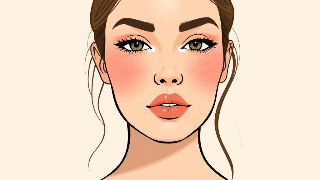
Cheeks and Blush: Blush placement follows the cheekbone structure. The blush sits on the apples of the cheeks and blends upward and backward toward the temples. When drawing blush, create a gradient from concentrated color to transparent blending. The color should appear to sit on the skin rather than floating above it. Consider how hydrated, healthy skin affects how blush appears—dehydrated skin shows makeup differently than well-moisturized skin.
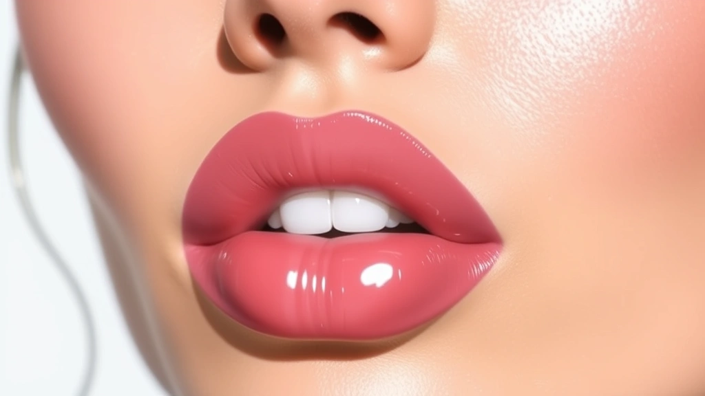
Lips: Lips have a complex three-dimensional structure with defined edges, highlights on the center, and shadow in the corners. Lipstick color must follow the natural lip contours, creating definition through color rather than outline. The upper lip has a natural shadow line, and the lower lip catches more light. When rendering lipstick, consider the finish—matte lipstick has defined edges and minimal shine, while glossy finishes create strong center highlights and appear wet.
Complexion and Foundation: The complexion beneath makeup affects the overall appearance. Foundation coverage varies—some areas have full coverage while others show more skin texture. Rendering this variation creates believability. Areas where makeup naturally sits thicker (around the nose, chin) should appear more opaque, while areas with lighter application show more underlying skin texture.
Contour and highlighting deserve special attention. Contour uses darker shades to create shadow and definition, while highlighting uses lighter, reflective products to catch light. When drawing these elements, remember that they’re subtle in realistic makeup application—heavy contour appears theatrical unless that’s the intended style.
Rendering Texture and Finish Effects
The difference between amateur and professional makeup drawings often comes down to texture rendering. Convincingly depicting how different products feel and reflect light elevates your work significantly.
Matte Finishes: Matte products absorb light and appear flat. When rendering matte makeup, avoid strong highlights and use softer edges. Matte lipstick has defined edges without the glossy reflection of other finishes. Matte eyeshadow appears velvety and absorbs light. Use subtle value changes rather than dramatic highlights.
Shimmer and Sparkle: Shimmer products reflect light in multiple directions, creating a sparkling effect. When rendering shimmer, incorporate multiple small highlights rather than one large highlight. The highlights should follow the surface contours—on eyeshadow, shimmer follows the eyelid’s curve; on cheeks, shimmer catches light on the highest points. The color appears slightly lighter where shimmer is most concentrated.
Glossy and Wet Effects: Glossy products create strong, concentrated highlights that suggest wetness and shine. This is especially important for lip gloss and liquid products. Create a strong highlight on the center of the lips or the highest point of the cheek. The surrounding area remains darker, creating contrast that suggests the glossy product sitting on top of the skin.
Translucency: Some products have translucent quality—you can see skin through them. Tinted lip balms, cream blushes, and some liquid products show this quality. When rendering translucent products, allow underlying skin to show through the color rather than creating a completely opaque layer. This requires lighter color application with visible skin texture beneath.
Blending and Feathering: Professional makeup appears blended, with color gradually transitioning from concentrated to transparent. When rendering, use multiple layers of increasingly lighter color to create this gradient. Feathering—creating soft, hair-like edges—makes blended makeup appear natural rather than painted. Use directional strokes that follow the direction of blending.
Advanced Techniques for Professional Results
Once you’ve mastered foundational skills, advanced techniques separate professional artwork from intermediate work.
Atmospheric Perspective and Depth: Even in close-up makeup drawings, subtle atmospheric perspective affects appearance. Areas receding slightly (like the inner corner of the eyes or under the cheekbones) appear slightly cooler and less saturated. The most forward-facing areas appear warmer and more saturated. This subtle shift creates dimensional depth.
Reflected Light and Bounce: Light bounces off surrounding surfaces, creating subtle reflected light in shadow areas. When drawing makeup in shadow areas (like the crease of the eyelid), incorporate subtle reflected light from surrounding areas. This prevents shadows from appearing completely black and creates luminosity.
Color Harmony and Contrast: Professional makeup drawings use color harmony principles. Complementary colors create visual interest—a warm peachy blush against cool-toned eyeshadow. Analogous colors (colors adjacent on the color wheel) create harmony. Understanding these relationships helps you create cohesive makeup looks in your drawings.
Layering and Glazing: Building makeup through multiple transparent layers creates depth and authenticity. Rather than applying color at full opacity, use multiple layers of increasingly transparent color. This technique is especially effective in digital painting and watercolor approaches. Each layer adds complexity and prevents the flat appearance of single-layer color application.
Negative Space and Implied Detail: You don’t need to render every detail to create convincing makeup. Strategic use of negative space and implying detail through suggestion can be more effective than rendering everything literally. A few well-placed highlights on eyeshadow suggest the shimmer finish without rendering every sparkle.
Digital Tools and Traditional Media Approaches
Different media present unique advantages and challenges for rendering realistic makeup.
Digital Painting: Digital tools offer unparalleled control for makeup rendering. Layers allow you to separate different elements, blend modes create realistic color interaction, and brushes can mimic various makeup textures. Use soft brushes for blending, textured brushes for matte finishes, and specialized brushes for sparkle effects. Layer blend modes like Multiply, Screen, and Overlay help create realistic color and light interactions. Start with a rough color sketch, then build up details and refinement through additional layers.
Watercolor and Gouache: Traditional transparent media like watercolor create natural blending and luminosity. The translucency of watercolor mimics the translucent quality of some makeup products. Build from light to dark, using the paper’s white to create highlights. Gouache offers opacity when needed while maintaining the painterly quality of watercolor. These media require planning because corrections are challenging, but the results often feel organic and natural.
Colored Pencils: Colored pencils offer precision and control. Layering different colors creates complex color mixing. Use light pressure for transparent effects and increased pressure for opacity. Blending stumps and colorless blenders help create smooth transitions. Colored pencils work well for detailed makeup rendering with fine control over edges and highlights.
Graphite and Charcoal Foundations: Many artists begin with graphite or charcoal to establish form and value. This monochromatic foundation creates strong understanding of light and shadow before adding color. Transfer or redraw onto colored paper or canvas, then apply color over the established value structure. This approach ensures solid fundamentals beneath color work.
Hybrid Approaches: Combining media often yields excellent results. Start with digital sketching, print the result, then add physical media like colored pencils or markers. Or begin with traditional media and scan for digital refinement. Experimenting with different combinations helps you discover your preferred workflow.
Common Mistakes and How to Avoid Them
Understanding common pitfalls helps you avoid them and accelerate your improvement.
Flat, Lifeless Color: Applying makeup as flat color without variation or blending appears artificial. Avoid this by incorporating subtle color shifts, value changes, and blended transitions. Use multiple layers of transparent color rather than single applications of opaque color. Study how light and shadow affect makeup color even on a flat surface.
Ignoring Skin Texture Beneath Makeup: Makeup sits on skin with texture, pores, and subtle imperfections. Rendering makeup as if it completely covers and smooths the skin appears unrealistic. Maintain visible skin texture beneath makeup, especially in areas with lighter application. A healthy skin barrier shows through makeup more clearly than compromised skin.
Harsh, Defined Edges: Makeup blends into skin and other makeup colors. Hard edges appear painted rather than applied. Soften edges through blending and feathering. Even defined makeup looks like eyeshadow or lipstick has soft transitions at the edges where it fades into surrounding skin.
Incorrect Proportions and Placement: Makeup placement follows facial anatomy. Blush placed too low or too far forward appears unnatural. Eyeshadow that doesn’t follow the eye socket’s contour looks wrong. Study anatomical proportions thoroughly and ensure makeup placement respects underlying structure.
Overworked Highlights: Too many highlights or highlights that are too bright and large appear cartoonish. Use highlights strategically on the highest points that catch light. Shimmer should suggest texture through multiple small highlights rather than one large bright spot. Restraint in highlight application creates sophistication.
Ignoring Light Source: Makeup appearance changes dramatically based on lighting. Consistent light source creates believable shadows and highlights. Decide on your light direction early and maintain it throughout. Light from above creates different makeup appearance than side lighting or back lighting.
Using Pure Black and White: Realistic artwork rarely uses pure black or white. Shadows in makeup contain color and aren’t completely black. Highlights contain color and aren’t pure white. Mix colors to create shadows that feel natural to the color palette. This prevents harsh, artificial appearance.
Neglecting Reference Images: Even experienced artists use references. Makeup application varies greatly, and references prevent assumption-based errors. Study professional makeup photography, makeup tutorials, and real-life makeup application. References inform accurate rendering and prevent stylized inaccuracies from becoming habits.
Building Your Practice and Development
Consistent practice with deliberate focus develops your skills efficiently. Rather than general drawing practice, target specific areas of makeup rendering.
Focused Studies: Dedicate practice sessions to specific elements. One session focuses exclusively on eyeshadow blending techniques. Another explores different lipstick finishes. Another studies blush placement and blending. These focused studies develop expertise in specific areas more effectively than general practice.
Speed Studies and Sketches: Rapid sketches develop your ability to capture makeup essence without overworking. Five-minute sketches force you to prioritize essential elements and avoid unnecessary detail. These studies train your eye to identify what makes makeup appear realistic.
Color Mixing Exercises: Dedicate time to understanding how makeup colors mix and interact. Create color swatches showing how different colors blend. Mix the exact colors you see in makeup references. This color study directly improves your ability to render realistic makeup colors.
Comparison Studies: Draw the same makeup look multiple times, comparing your results to references. This comparative practice identifies specific areas where your rendering differs from reality. Each iteration improves as you address identified discrepancies.
Studying Professional Work: Analyze artwork by professional makeup artists and beauty illustrators. Study their techniques, color choices, and how they render texture and finish. Understanding professional approaches accelerates your development.
Remember that developing skill in drawing cosmetics requires patience and consistent practice. The complexity of makeup rendering—combining anatomical accuracy, color theory, texture rendering, and light behavior—means mastery develops gradually. Celebrate incremental improvements and maintain focus on deliberate practice rather than rushing toward perfection.
Consider how proper skincare affects makeup appearance in your reference studies. Well-prepared skin shows makeup more beautifully, and understanding this relationship improves your rendering accuracy. The interaction between skin condition and makeup application creates more convincing artwork when you understand these connections.
FAQ
What’s the best medium for drawing realistic makeup?
Digital painting offers the most control and flexibility for makeup rendering, but traditional media like watercolor, gouache, and colored pencils create beautiful results. Your best medium depends on your personal preference and strengths. Many professional artists use hybrid approaches combining multiple media.
How long does it take to develop realistic makeup drawing skills?
Consistent practice for 3-6 months typically shows noticeable improvement in makeup rendering. Mastering the skill requires 1-2 years of dedicated practice. The timeline depends on your starting point, practice frequency, and focus on deliberate improvement rather than casual drawing.
Should I focus on one makeup look or practice variety?
Practice variety helps you understand different makeup applications and styles. However, repeating the same look multiple times improves your ability to render it realistically. Balance variety with repetition—practice multiple looks but return to favorites for deeper refinement.
How important is understanding makeup application for drawing it?
Understanding actual makeup application is crucial. Knowing how makeup is applied, in what order, and how products interact with skin directly improves drawing accuracy. Watch makeup tutorials, practice makeup application yourself if possible, and study the application process as carefully as the final result.
What’s the most challenging aspect of drawing realistic makeup?
Rendering realistic blending and transitions challenges most artists. Makeup appears blended and soft in reality, but achieving this in artwork requires careful color mixing, layer building, and understanding how colors transition. This element typically requires the most practice to master convincingly.
How do I render makeup on different skin tones accurately?
Makeup colors appear different on various skin tones due to undertone differences and color contrast. Study makeup looks on multiple skin tones to understand how colors shift. Consider undertones (warm, cool, neutral) and how they interact with makeup colors. Practice rendering the same makeup look on different skin tones to develop this skill.